
TDA Connect Overview
A virtual platform where TDA graduates can safely come together. Provided by the non‐profit Safe Place International (SPI).
My Role
Team
Timeline
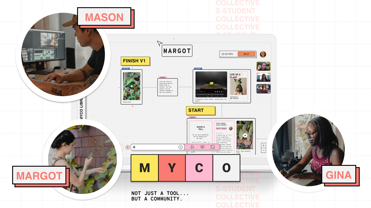
Toolkit
My role
- I continued to set the direction for the profile management, friend management, and the design visual system, partnering with and acting as a liaison to our engineering team. Click to read about Phase 1.
- I led the quality assessment for our design system ensuring all submitted components promoted best practices and aligned with our guidelines based on Material design 3. I also partnered with our second design team's leads to ensure consistency in both teams' designs.
- I existed as the unofficial third co-team lead for our design 1 team as I found myself assisting both my co-leads with vital SME information from phase 1 and also taking the initiative on design decisions and making myself available as a mentor to my teammates.
Project Deliverables
Case studies of the areas I focused on during phase 2


Who is Safe Place International (SPI)?
SPI is a non‐profit organization that's helped 800+ double-marginalized LGBTQ+ refugees, asylum seekers, and single mothers worldwide.
- Provides support & resources through a virtual 10‐week structured program called The Dream Academy (TDA).
What's the problem?
- Most TDA members feel unsafe and not secure when using popular social media platforms.
- Post-grad WhatsApp groups are overwhelming & capped at 400 members.
- Alums are lacking ways to network, access resources, report crime safely, & be self-expressive.
- ~50% drop‐off rate in communication and contribution amongst alums
- Recently passed Ugandan LGBTQ+ criminalization laws.
Design response: TDA Connect
The profile and friend management features live within the TDA Connect portal. Alums have complete safety and privacy control over their profiles to represent their true selves and build a community by connecting, with other TDA alums in or outside their cohorts with similar interests.

What were the challenges?
- How might we build a safe and secure virtual platform for TDA graduates that accounts for low‐bandwidth capabilities and is accessible via mobile and desktop?
- How might we refine the current designs for profile management to improve usability and customization when filling in profile details?
- How might we improve the sense of safety and seamlessness for adding friends on the portal?
- How might we improve the way users manage their friends lists and requests?
What were the goals?
Create a portal that:

Provides safety

Builds community

Provides resources
Business goals - MVP
SPI's priority portal features
After meeting with our client to discuss the root user problem further (50% user drop-off rates and the need for a resource center), our team identified the following five portal features as top priorities for phase two of this project. Our team believes that implementing these features will help create a minimal viable product (MVP) and bring success to SPI.

- Profile + Friend management *
- Onboarding
- Social Feed (homepage)
- Groups *
- Resource Center
* Features I worked on.
Who's our users?

800+ TDA graduates

LGBTQ+ & Refugees mostly living in Africa

Low‐bandwidth & unstable internet
What needed fixing?
Let's break these two features down

Phase 1 design audits
Heuristic evaluations (HE)
I began my redesigns by reviewing Phase 1's usability testing insights and performing a heuristic eval for the profile management + friend management flows to catch any usability issues.
Yielding these HE insights:

click to enlarge
- Privacy page: add privacy toggles for the groups, recent activity, and friends sections.
- Improve navigation (back/exit buttons) and simplify CTA buttons globally.
- Create a 2-part friend request flow, so users can send a note.
- Improve confirmation messages for sent friend requests
- Add a friends list showing mutual friends to the profile page.
- And lastly, redesign the friends list page to improve white space and hierarchy.
Content design audits

During this time, I also collaborated with a content designer on my team to implement changes that improved the copy on the profile and friend management flows.
How did we further define the problem?
Working with the research team
Our research team virtually met with 8 TDA Alums to learn more about their lives and what current issues they're facing post graduation. Prior to the interviews my team and I sent questions/topics to the research team for our users to answer.
Key findings
- Passion projects are only available in TDA classes.
- 100% of participants are empowered through helping people.
- 88% of participants valued acts of kindness.
- They'd enjoy seeing celebrations/reminders on the portal.
Profile management iterations
Redesigning with intention
Design goals
I continued to use the design goals I defined in phase 1 as I redesigned the profile management flow: encouragement, low‐bandwidth capabilities, customization (self‐expression), and safety.
Embacing project constraints
A lot of the leftover questions from phase 1 regarding design (low‐bandwidth) and security constraints (on an engineering level) were finally answered by our engineers + product managers.
I incorporated the feedback from engineers along with the insights from user interviews as I started redesigning the profile management pages.
Edit profile
I set out to improve the navigation, allowing users to exit or go back while editing their profiles and access the Profile privacy page without opening the hamburger menu.
Solution:
- Full-page dialog design
- Renaming the section officially to profile management combining the two pages
These changes improved usability by adding an exit button and page tabs to swap between Edit profile and Profile privacy.

Profile privacy
Working with the content team proved valuable as it helped me remove headings and other clutter to improve the page's whitespace.
Solution: I added Friends, Recent activity, and Groups to this page, allowing users complete privacy control over all content displayed on their profiles.

Profile page
The main goal for redesigning this page was to fix spacing, design additional features added from the Profile privacy page and those wanted by alums, and improve the copy.

Final solutions for Profile management
Feature highlights
Because the Profile management feature had most of the designs completed during phase 1. I focused on improving and adding community features for TDA alums.
Additional photo banners
Design goal: customization
I'm very passionate about helping others. And getting to know more people and understanding the needs of members of our community.
-P1
In phase 1, I created TDA Grad year photo banners. I designed additional banners to signify TDA Connect members wanting to help other members.
Research showed that 100% of participants found empowerment in helping others and wanted an identifier to continue practicing kindness. The list of potential banners is growing, and so will the variety of banners there as the portal expands.

Passion projects

Design goal: customization
I have learned a lot from reading students' passion projects. It has taught me to redefine what the word success means.
-P2
Profile pages now showcase passion projects. Insights showed that 50% of alums longed to continue building their passion projects and community on the portal after TDA classes ended.
Profile page friend lists
Design goal: safety/community
Added friend lists to profile pages showing the number of mutual friends even if that user has their friends list private.

Community focused icons
Design goal: encouragement/community
...Realized that if it's your birthday...you have achieved something. We celebrate you...[Those] kind of reminders would be something that I would also want to see.
-P6
Research showed TDA alums appreciated celebrating achievements. So, I created reminders for birthdays and TDA Connect anniversary dates. These icons will appear throughout the portal.
In phase 1, users mentioned use of the ASL love symbol, so we included that icon by letting it signify likes on posts. Incorporating community-focused icons throughout the portal supports community building.
Friend management
Redesigning with intention: brainstorming and sketching
The redesigns for friend management required more brainstorming as I wanted to revamp the entire process of sending a request.
I split the friend management into two flows with a teammate. These flows helped me visualize every step a user could take to add friends.
- Add a friend
- View sent/received requests
I then sketched ideas via Crazy 8's, a great way to generate ideas by eliminating the possibility of overthinking concepts and maximizing creativity.


Previous design and wireframe iterations
I created mid-fi wireframes to help visualize the recommendations and features ideated during crazy 8s. I annotated my workflow to receive direct feedback and help my team get the bigger picture of my designs.

Pivoting...
Early on, I became the sole designer for the friend management features after my teammate departed the project. However, despite the departure, because I led the design decisions for this feature, I was able to carry on effortlessly.
I incorporated the feedback from engineers along with the insights from user interviews as I started redesigning the friend management pages.
Add a friend
Design goals: encouragement, community, and safety
- Simplified call‐to‐action buttons
- Created an optional 2‐part friend request process with editable quick‐add suggestions for sending, thus personalizing this feature.

Friend requests page
Design goals: safety, customization
- Separate pages for sent + received requests
- Viewing optional friend request messages
- Users can cancel sent and delete received requests

Friends list page
I also solely worked on redesigning the friends list page. My main goals focused on improving whitespace, adding a section for users to access their friend requests, and introducing potential features to explore in phase 3 such as friend recommendations.

Usability testing and design validations
I worked with the research team to decide which flows to re-test with our stakeholders. We decided to test the Add a Friend flow as the entire profile management flow wouldn't benefit from re-testing. I was present for one of the six usability tests performed.
Task prompt: You see Jaheem's introduction post and want to add him as a friend; how would you go about doing that?
Goal: see how intuitive the newly redesigned 2-part friend request feature was.
Outcomes and design validations: All six users found the task easy and completed it quickly. Yet, one user assumed they were required to include a message.
Design iterations
Incorporating feedback
Post-usability testing I worked with the content team once again to improve the visual hierarchy and provide a seamless user experience for the 2-part add a friend flow.

A peek into how I collaborate
Throughout this phase, my teammates and I collaborated via agile methodologies through the use of voting pages and Figma comments.
Collaboration was vital in helping me work through constraints and design decisions as I incorporated feedback from user testing, stakeholders, and teammates into my hi-fi iterations.

Click to enlarge
Final solutions for Friend management
Add a friend
Now, users explicitly know that sending a message with their request is optional.

Click to enlarge.
Visuals
Walk throughs
Profile management
Friend management
Impact
“[In response to my profile photo banners]: “Oh, that's so good, thank you!””
- Cherie Singh - SPI's Director of Operations / Trainer - Employability Skills
“Thank you so much for your incredible attention and resourcing regarding security. That's a huge, huge thing. And it's becoming more and more important as things devolve in the communities that we are serving. So I really appreciate that.”
- Rachael LeClear - SPI's Executive Director
Success metrics
- Has the portal improved SPI's retention rates?
- Has the percentage of continued passion projects increased?
- Has TDA Connect helped users grow the community?
- Has TDA Connect facilitated connections?
- Do members feel safe using this platform?
- Per user testing for the social feed page: Users felt thankful and safer knowing they can mark their posts on the social feed as “sensitive” by using a list with sensitive topics that I created during phase 1.
Next steps: Phase 3
- Profile management: Security and privacy: implement recommendations from the security/privacy document. Front-end: Build out the UI for this feature.
- Friend management: test and improve the 2-part friend request flow and improve suggested messaging.
- Continue working with web developers and content designers to ship the virtual platform.
Conclusion
I grew as a designer throughout this second phase. I took on more leadership roles that challenged and inspired me to keep a growth mindset as I approached each sprint of this project. I commend how I handled mentoring teammates, being leaned on for my knowledge from phase 1, taking on multiple roles in the team (designer and QA for the design system), and managing pivots, blockers, and losses of teammates across our entire project team.
These tough lessons helped improve my efficiency as a teammate and trickled down into helping my team make smarter decisions.
Time management is a vital designer skill, and Phase 2 showed how crucial it is to have a consensus on expectations for time spent designing, in meetings, and more, compared to Phase 1. Our team eventually worked through our constraints and implemented tactics such as timers and notetakers to keep meetings seamless and short.
Completing this project showed me that I am ready to stretch my wings as a designer. I'm eager to seek that next challenging step and project.
