TDA Connect Overview
A secured web and mobile virtual community portal for the non‐profit Safe Place International (SPI)'s double‐marginalized LGBTQ+ and refugee program members.
My Role
Team
Timeline
Toolkit
Who is Safe Place International (SPI)?
SPI is a non‐profit organization that's helped 800+ double-marginalized LGBTQ+ refugees, asylum seekers, and single mothers worldwide.
- Provides support & resources through a virtual 10‐week structured program called The Dream Academy (TDA).
What is the problem?
- Most TDA members feel unsafe and not secure when using popular social media platforms.
- Post-grad WhatsApp groups are overwhelming & capped at 400 members.
- Alums are lacking ways to network, access resources, report crime safely, & be self-expressive.
These limitations have led to a ~50% drop‐off rate in communication and contribution amongst alums.
What's the challenge?
How might we build a safe and secure virtual platform for TDA graduates that accounts for low‐bandwidth capabilities and is accessible via mobile and desktop?
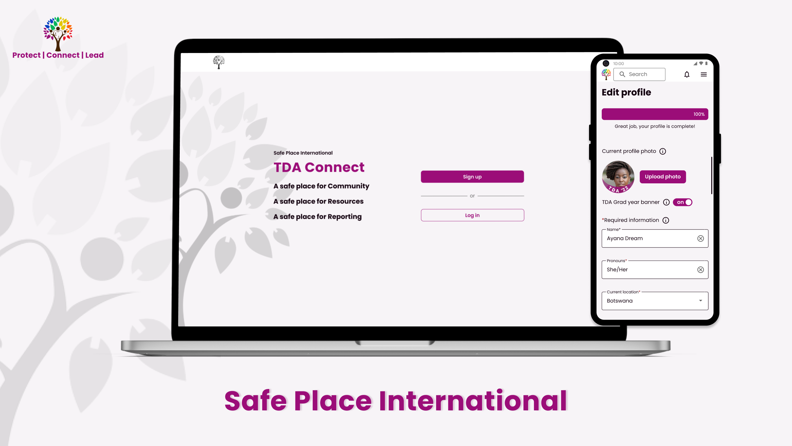
Design response: TDA Connect
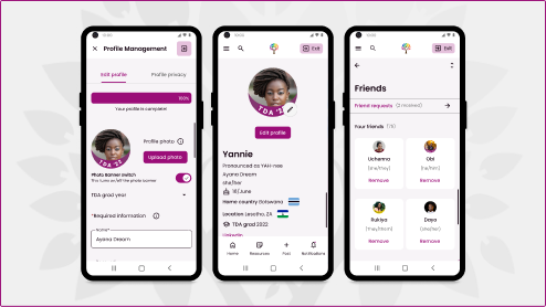
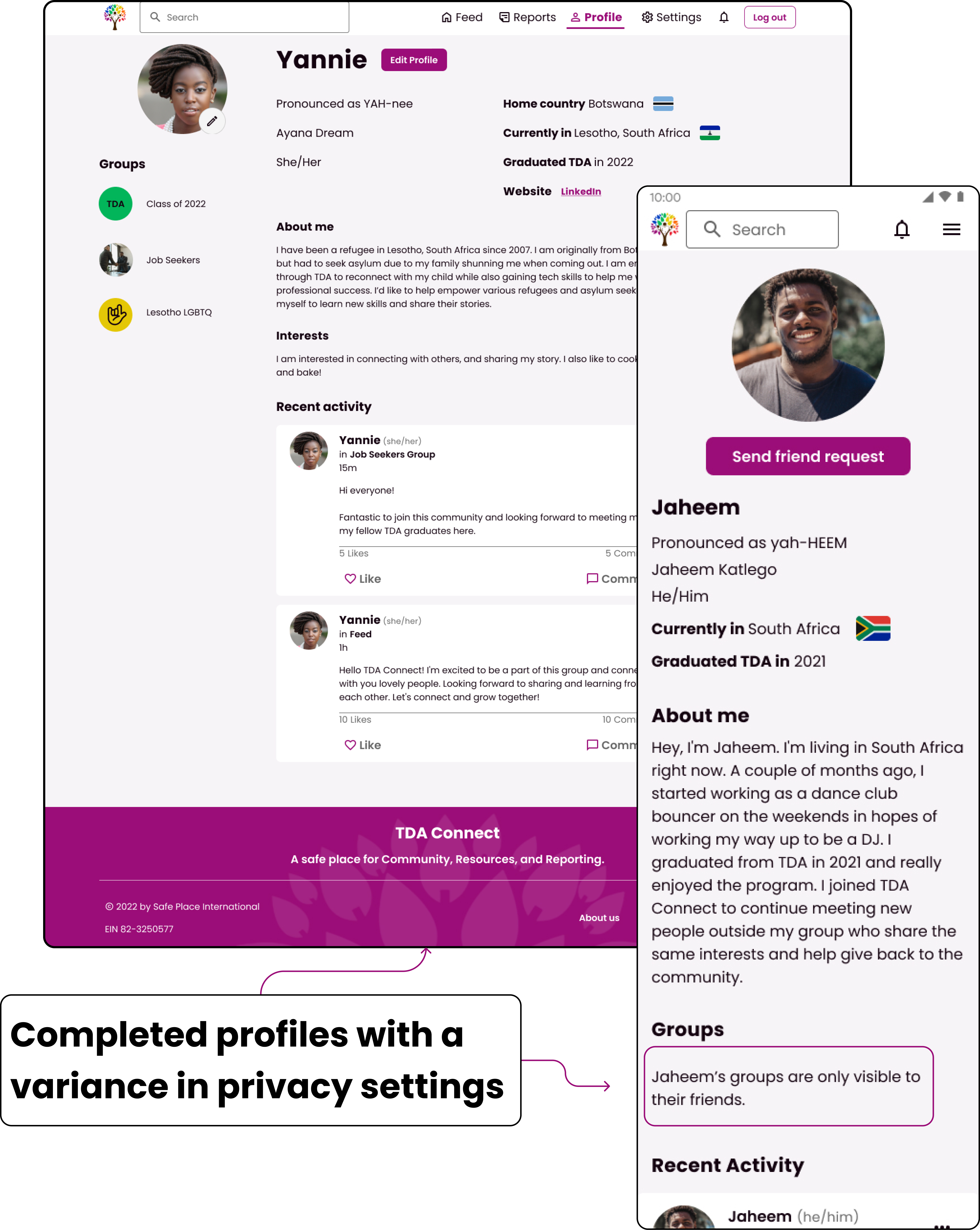
The profile management feature lives within the TDA Connect portal. Alums can customize their profiles to represent their true selves. They have complete control over their visibility and privacy on the portal. Users can use the TDA grad photo banner to be easily recognized by their cohort members, write in their specific pronouns, and express themselves via bios and interests sections.
What were the goals?
Create a portal that

Provides safety

Builds community

Provides resources
Business goals - MVP
SPI's priority portal features
After meeting with our client and discussing in further detail the root user problem (50% user drop-off rates), we collaborated with our team's strategists to prioritize ideas/problem solutions to work on first. For phase one of this project, our team prioritized five portal features that we believed would create a minimal viable product (MVP) and bring success to SPI.
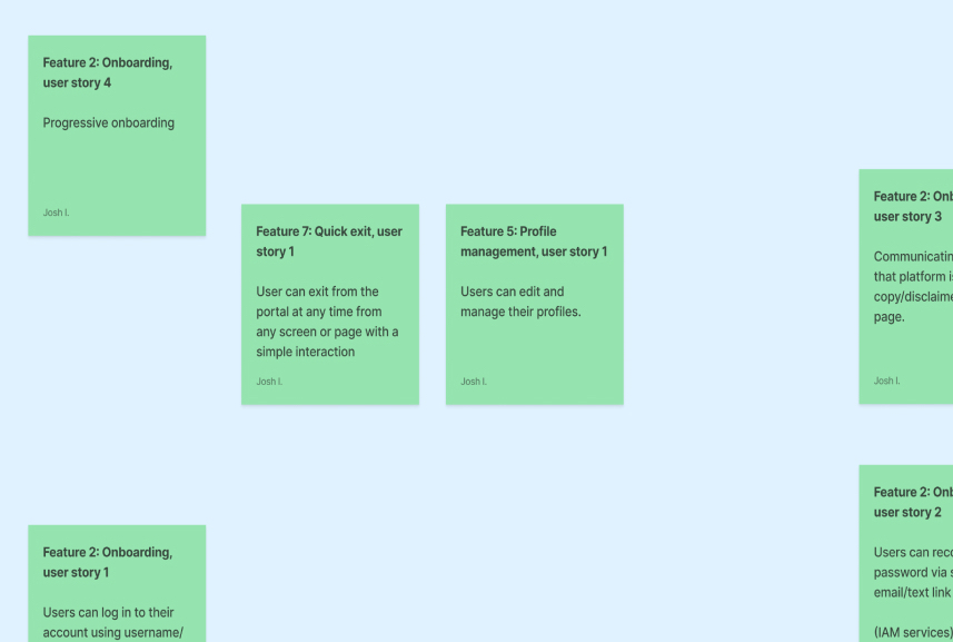
- Profile management*
- Onboarding
- Feed (homepage)
- Account settings*
- Reports
*Features I worked on.
Who were we designing for?

800+ TDA graduates

LGBTQ+ & Refugees mostly living in Africa

Users with low‐bandwidth & unstable internet
The discovery process
Research methods
We worked partly with the research team to dig deeper into the pain points and learn more about our users' circumstances.
- Competitive analysis & secondary research
- Primary research*
- 7 User Interviews
- 12 Surveys Responses
- 1 Focus Group (3 people)
*Due to an unexpected but temporary loss in communication with our client, our research team didn't conduct primary research until our design team was midway through ideation.
Competitive analysis & SWOT
To get an idea of how other websites geared toward creating safe spaces for members of the LGBTQ+ community, I collaborated with one of the UX researchers on my team to explore TrevorSpace: An LGBTQ+ moderated community.
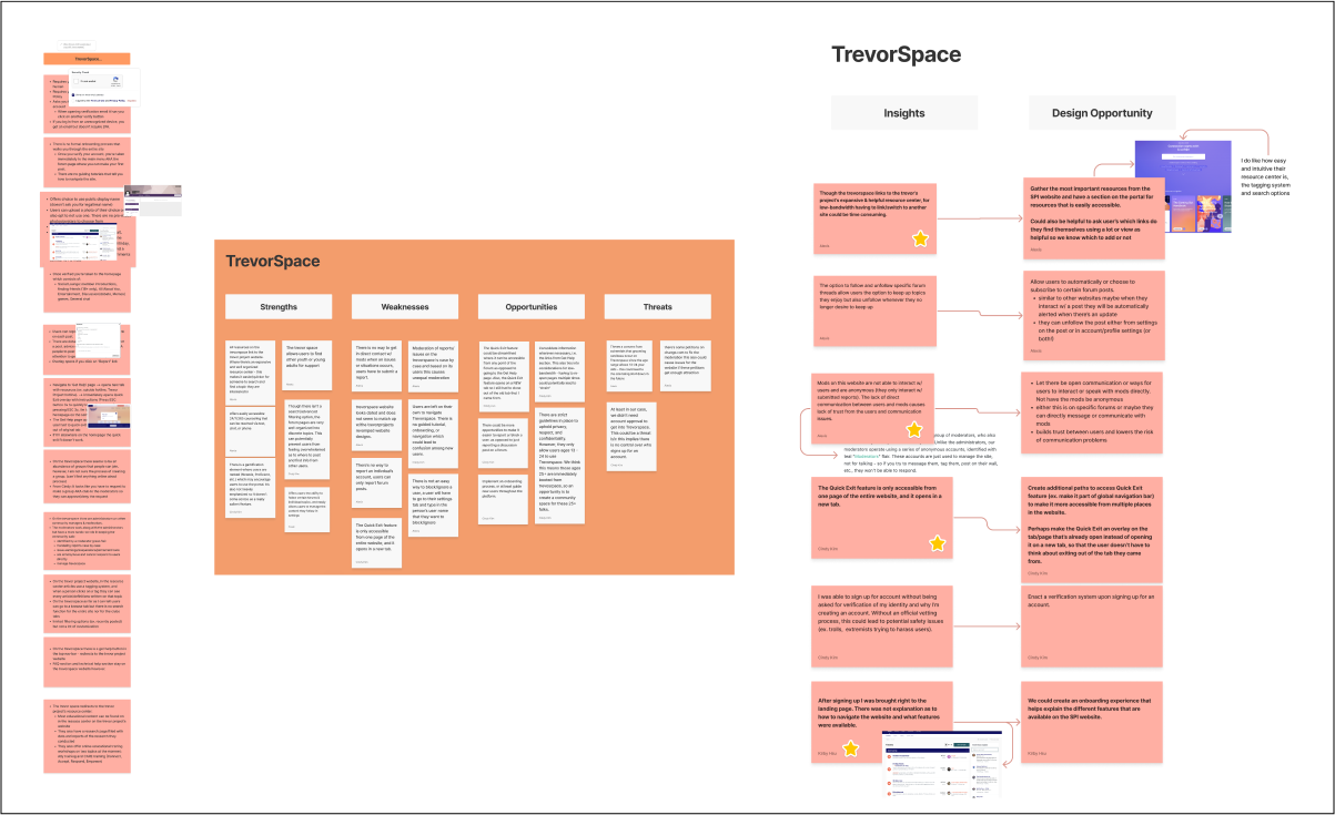
Compet. analysis results yielded:
- The portal's onboarding flow could highlight the main features
- Have resources easily accessible on the portal
- Add a Quick Exit safety feature that navigates away from the portal
Primary research insights
Once the research team had the opportunity to interview our stakeholders mid-way through our project, these were the insights we discovered from the data:
- Users are comfortable sharing personal information (profile photos, locations, etc.) only with TDA grads and SPI.
- Some users prefer anonymity.
- Most access the internet on mobile and experience connectivity issues.
- A low‐bandwidth build is more inclusive and usable.
Designing with intention
Embacing project constraints
The lack of client/stakeholder feedback, low‐bandwidth considerations, lack of web developers, and last-minute pivots were four significant constraints for me as I ideated potential design solutions. To navigate these constraints, my teammates and I utilized agile methodologies that involved constant iterations, feedback (teammates and clients), and testing for our designs. I also had the idea to reach out into our community for knowledgeable developers to help guide our team through certain design decisions.
Insight‐derived design goals for profile management:
- Encouragement - features that encourage users to complete their profiles and use the portal.
- Low‐bandwidth considerations - to ensure users with these pain points can use all of the features on the portal.
- Customizable (self-expression) - let users feel comfortable enough to show their true selves.
- Safety - users should not feel like they have to be cautious on this app and will have total control over their privacy on the portal.
Brainstorming, sketching, prototyping
From sketches to mid-fi wireframes
To help me understand TDA grads' wants and goals for managing their profile pages. I worked with a teammate to create Profile Management journey/affinity maps and a user flow diagram. I then sketched ideas via Crazy 8's, focusing on the edit profile/profile privacy half of the profile management flow.
After evaluating the research insights, I ensured that my design decisions helped users feel safe about the information they'd reveal on their profile pages. I designed adjustable drop-down privacy settings for each category and included tooltips to explain specific features and define requirements.
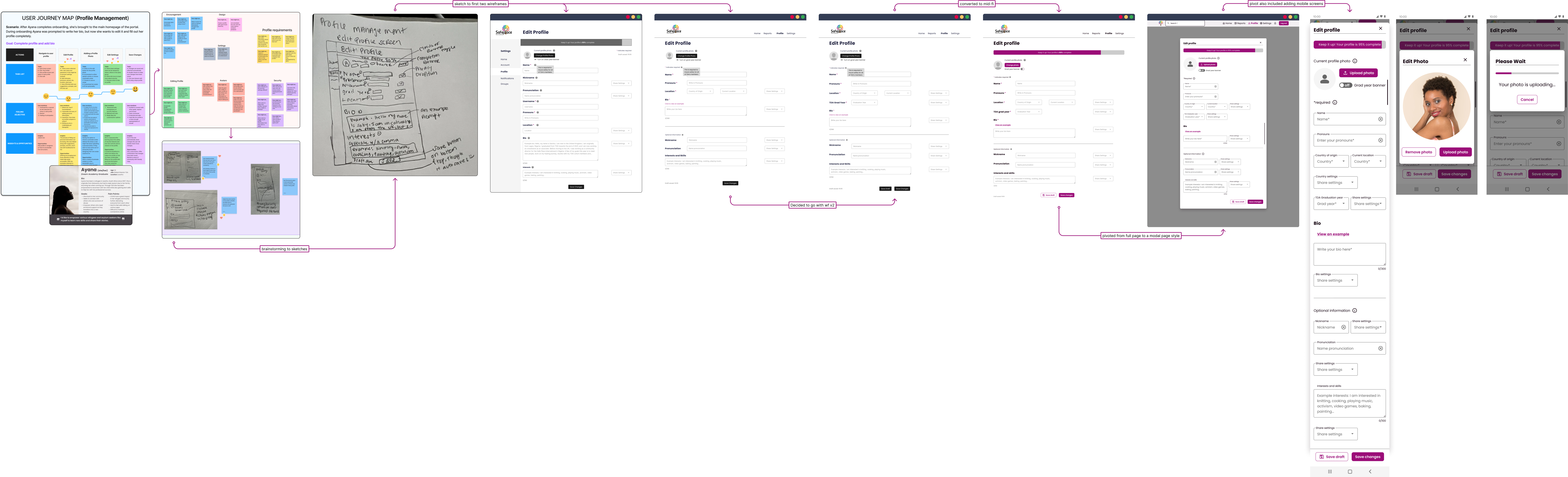
Mid‐fi stopping point
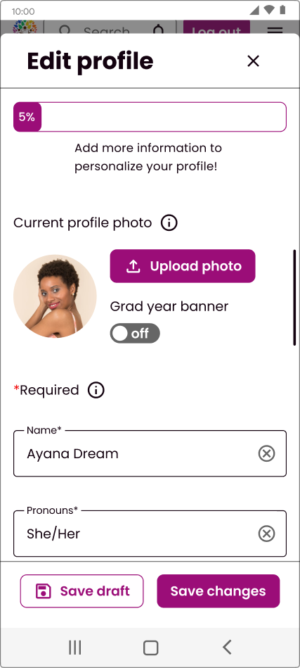
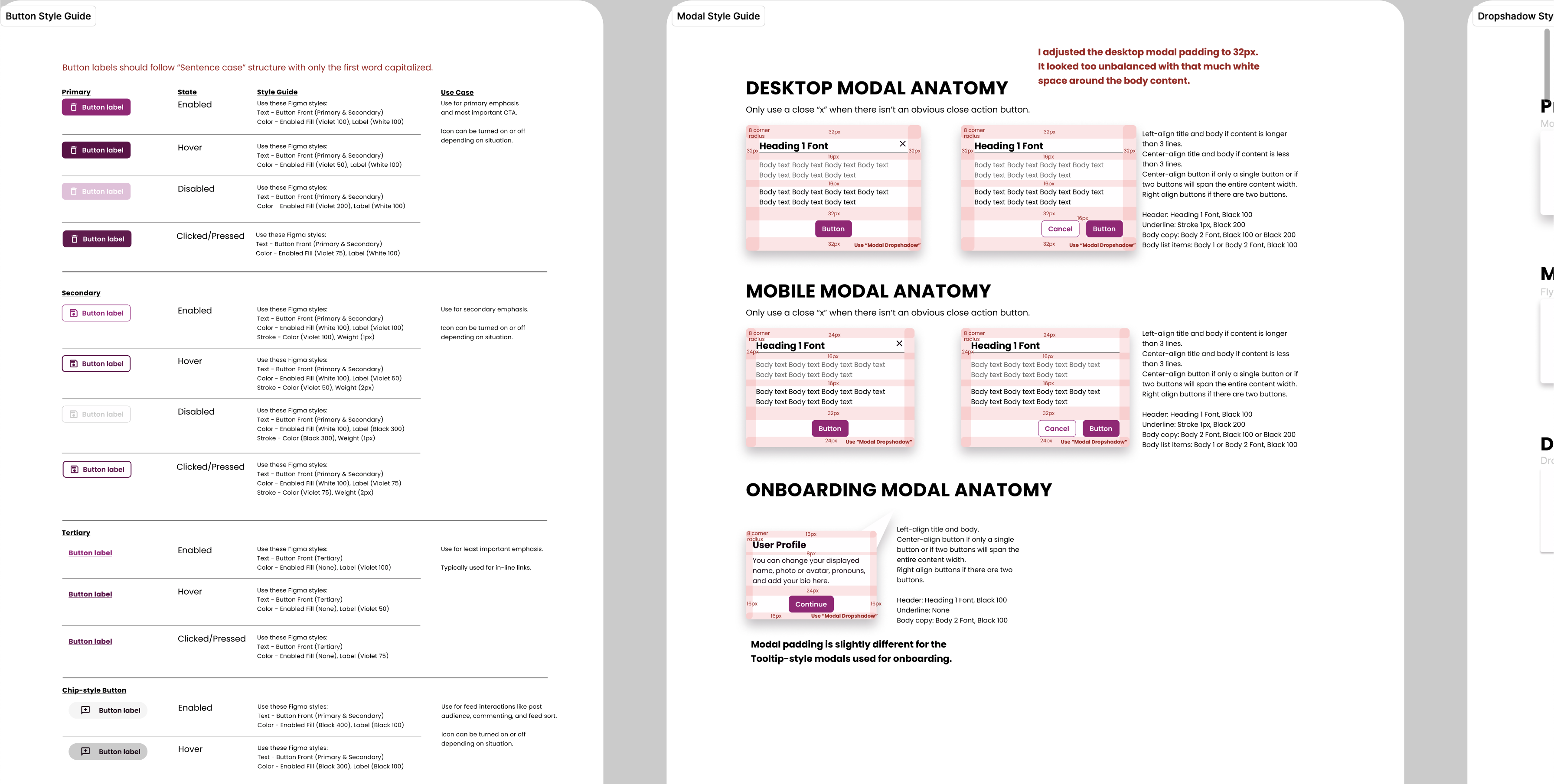
This stopping point added consistency and cohesiveness across the portal because our team added Material 3-based components that we voted/collaborated on from our design system.
Once we got back into contact with our clients and learned that most of our users used mobile devices, we pivoted to incorporate the mobile version of the portal (aka converting our desktop designs down to smaller handheld bite sizes). We were spot on for choosing M3 to base our design system on as most alums use android phones.
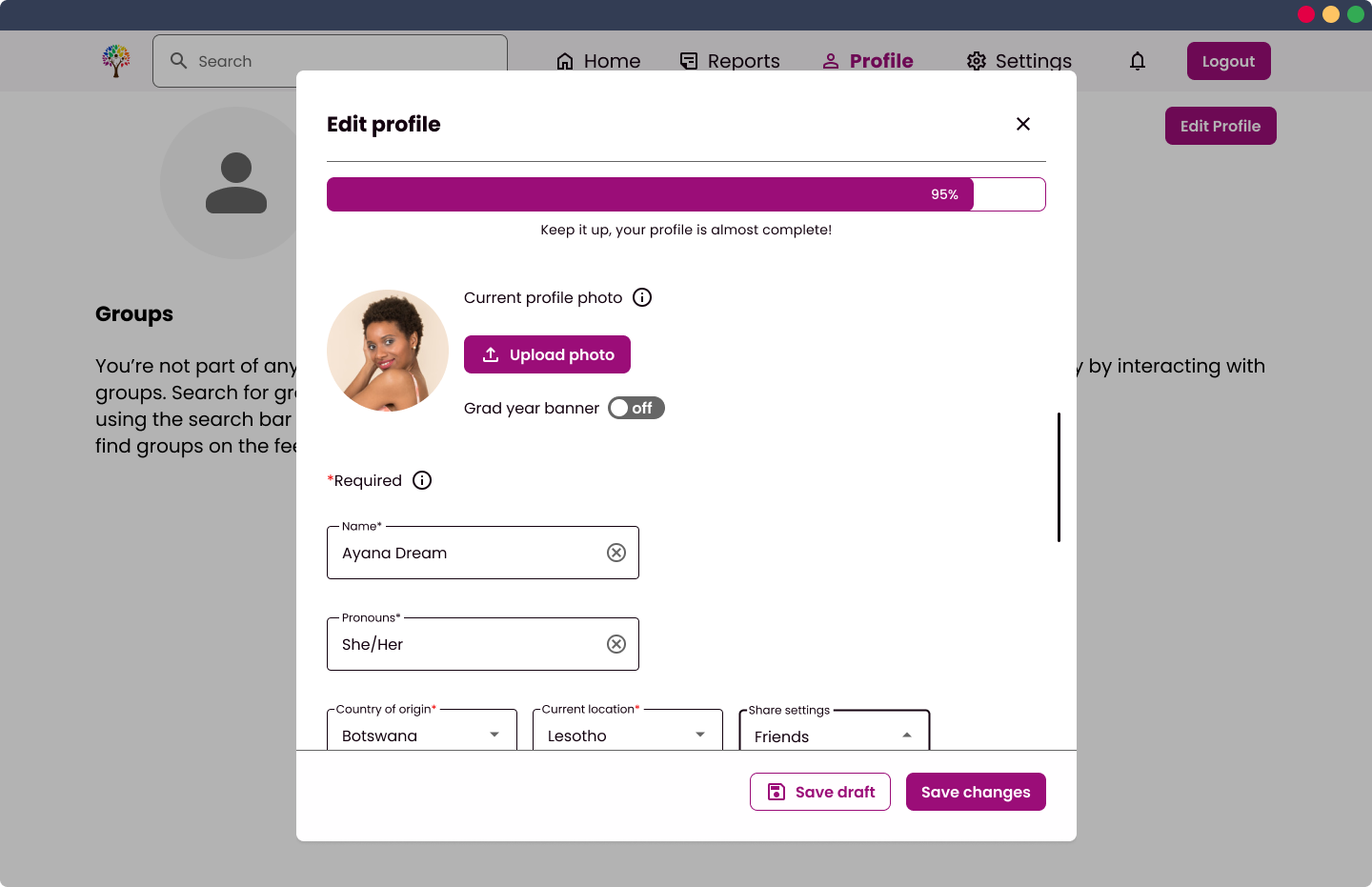
Usability testing and design validations
We worked with the research team to get our mid‐fi designs to the TDA alums.
Usability testing allowed me to finally receive stakeholder feedback and validations that continued to inform my design decision as I headed into high-fidelity iterations.
Testing methods: 6 moderated usability tests, 2 unmoderated tests (via Maze), and 1 focus group (3 people).
I validated my mid‐fi designs based on the following feedback from TDA alums:
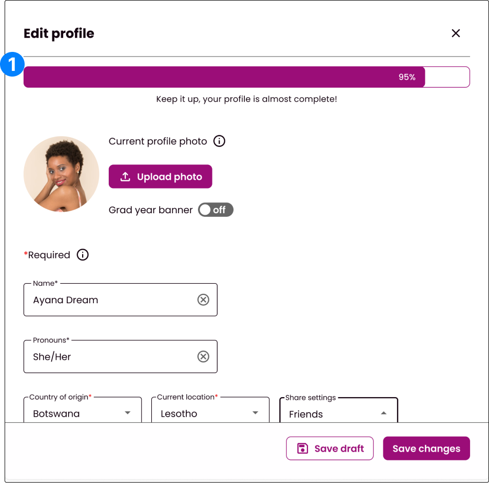
1. Progress bar
Design goal: encouragement
I like that I can check here and know if I have filled everything or not.
Insight: Users found the progress bar helpful when checking the status of their profile completion.
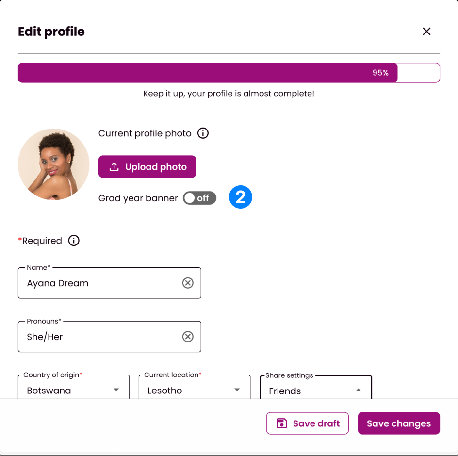
2. Grad banner
Design goal: customization
I do not know what this grad year banner means.
Insight: Users needed more clarification about the purpose of the grad banner.
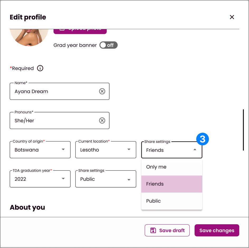
3. Share settings
Design goal: safety
I can choose who I want to share each information with. Its nice.
Insight: Users felt safer knowing they have the option to choose who they share information with.
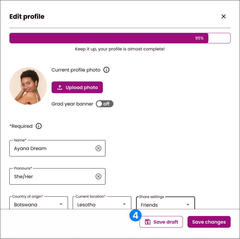
4. Save as draft
Design goal: low-bandwidth
I will save as draft if I am not able to complete it.
Insight: Users liked the flexibility of completing their profile whenever.
Iterations
Incorporating feedback
In addition to user testing, my teammates and I also performed heuristic evaluations on the five sections of the portal to ensure that our designs remained consistent and that our design decisions aligned with our insights/goals.
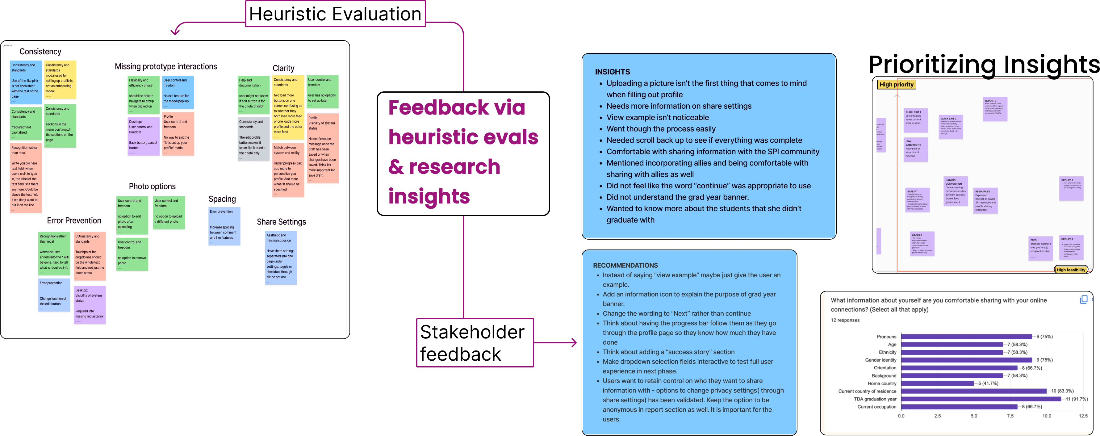
A peek into how I collaborate
Throughout this phase, my teammates and I collaborated via a voting page and comments in Figma.
Collaboration was a vital part of the agile methodology that helped me work through constraints and design decisions as I incorporated feedback from user testing and heuristic evals into my hi-fi iterations.
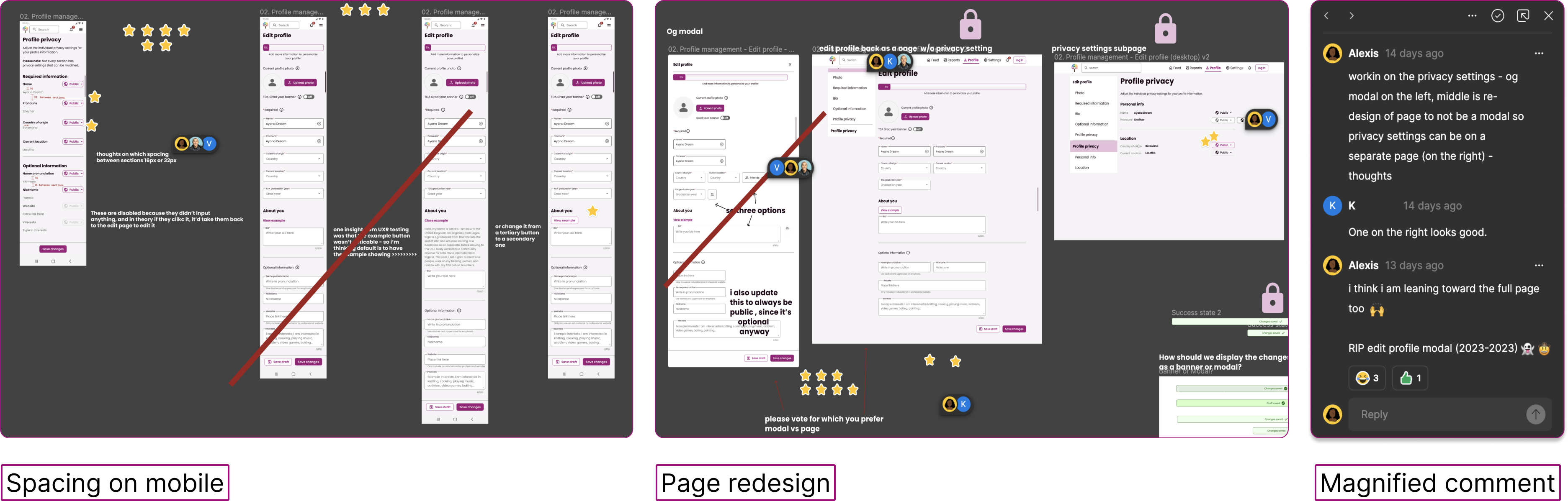
Click to enlarge
Solutions: final designs for Phase 1
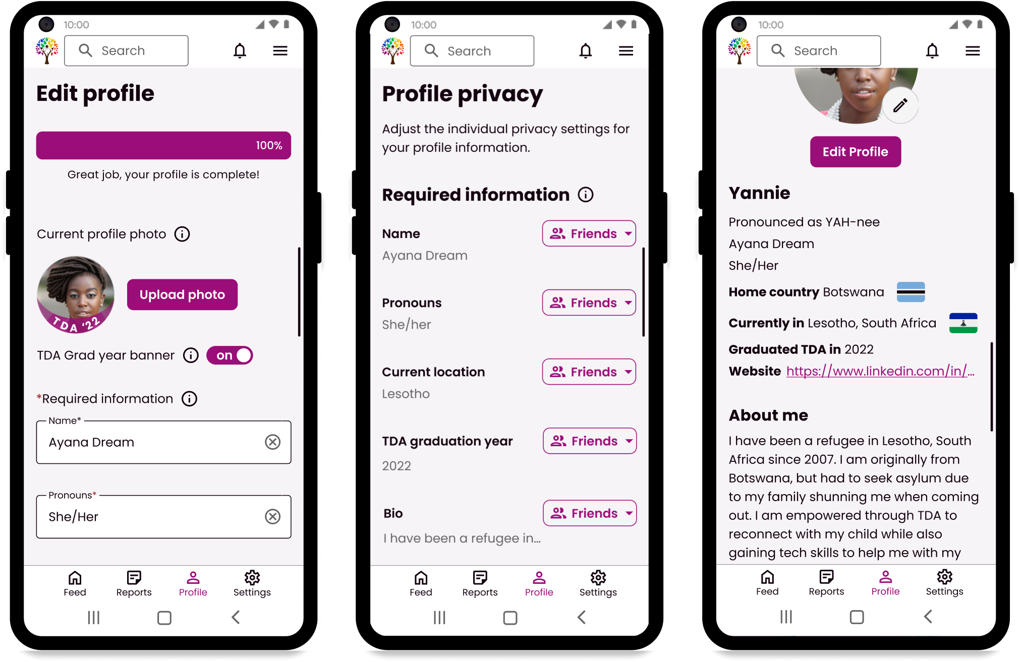
Edit profile and Profile privacy pages
I further iterated on my designs to improve the features validated from user testing.
I turned my mid-fi into high-fidelity designs, entailing a total redesign for the edit profile page that separated the privacy settings onto another page for better organization, hierarchy, and emphasis on safety settings for each category.
In addition, I added more clarity to certain features and vocabulary that confused our users during usability testing.

Click to enlarge.
Profile page
I took over the designs for the profile page.
Below is how two completed profile pages would look with specific privacy settings set for different audiences.
Users can remove their profile photo without replacing it with another one. The privacy and post settings for Feed posts are also adjustable on the user's profile page via the hotdog menu on each post.
Friend requests
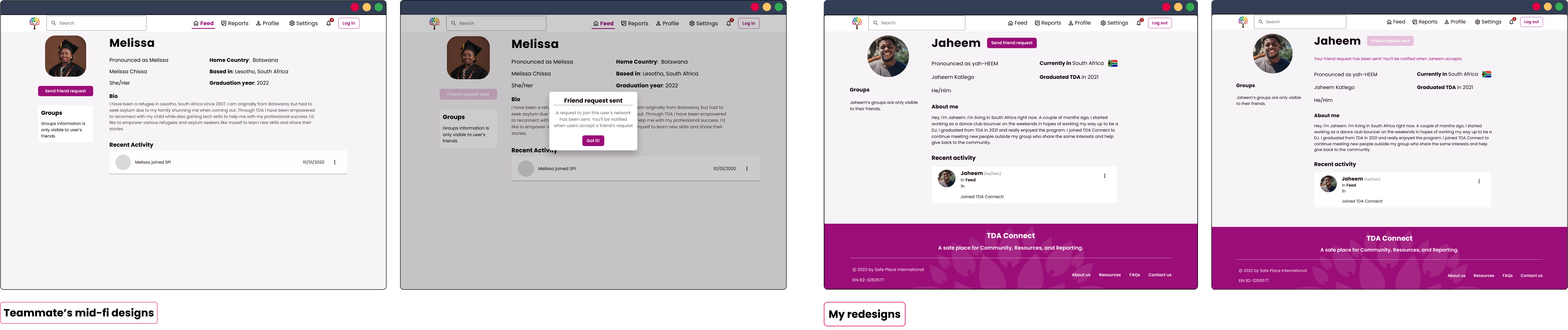
Toward the end of our project, I redesigned another teammate's designs for the sending-a-friend request flow.
I re-arranged the friend request call to action button to a location that would feel more familiar to the users as seen on other platforms. I also wanted to limit the amount of clicks/modal interactions for users with low-bandwidth constraints. Lastly, I changed the sample profile information to an example user that fits our users' demographics.
Click to enlarge.
Account and Notification Settings
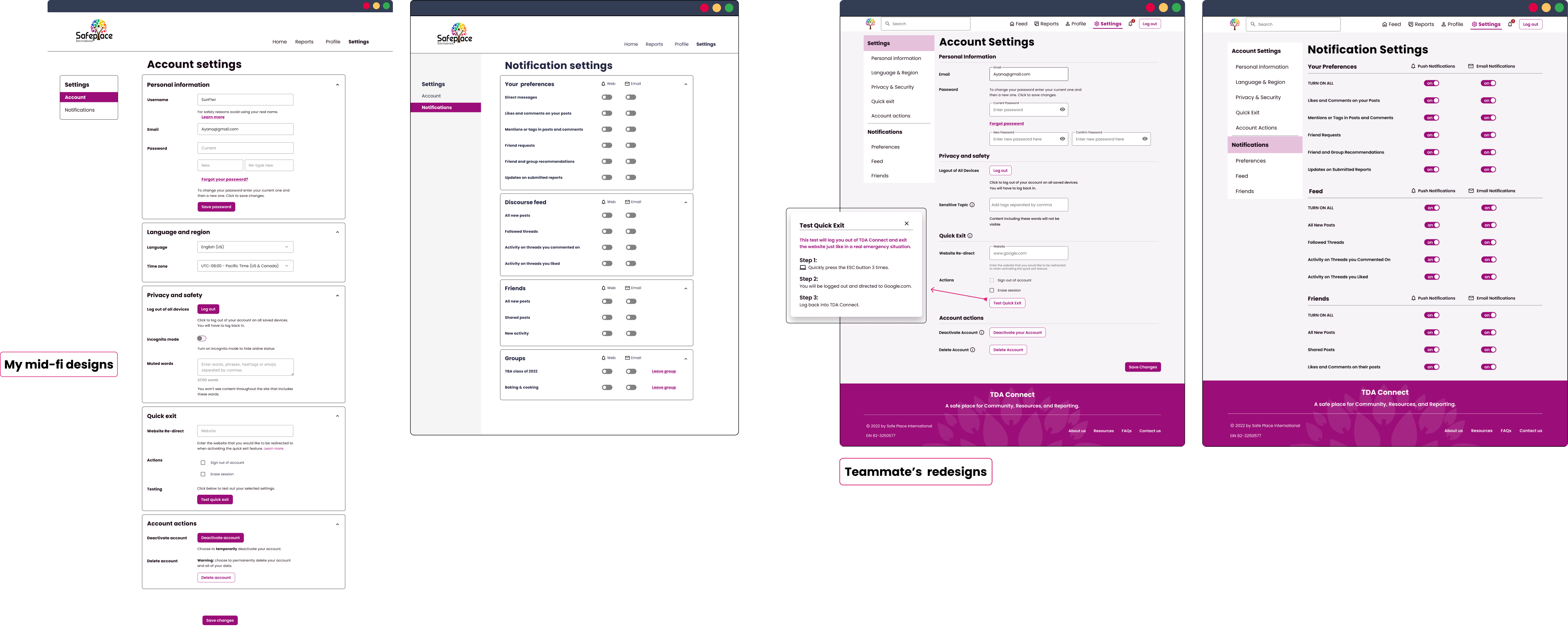
I also worked on the low-fi and mid-fi designs for account settings before handing it off to my teammate to work on the hi-fi designs.
Click to enlarge.
Impact
“[The portal is] so in line and in sync with what [we] are focusing on at SPI.... this is like the key to what we were looking for all this while.”
- Cherie Singh - SPI's Director of Operations / Trainer - Employability Skills
Success metrics
- Has the portal improved retention rates?
- Has it helped users grow the community?
- Has it facilitated connections?
- Do members feel safe using this platform?
- Update from phase 2 - users feel safe using this platform and cannot wait for it to ship!
Next steps: Phase 2
- Test the high-fidelity designs with stakeholders and continue to iterate on them.
- Flesh out more of the lower-priority ideas and features for the virtual platform pushed to Phase 2 of this project (groups, DMs, resources, reports).
- Continue working with web developers and content designers to ship the virtual platform.
Conclusion
I think this was an important project for me to work on that allowed me to navigate plenty of constraints within the product and with our stakeholders and client. The loss of communication with our client allowed my teammates and I to take the initiative for certain design decisions that proved to be a step in the right direction once we received user validation.
I also think this project helped me solidify one of the types of work I enjoy as a designer: community‐building‐based projects.
But all in all, I am excited to see this project continue to evolve and for myself to continue working on the second phase. Because I know this product we are building will make an incredible difference in the TDA alums' lives.