- Time length
- 10 weeks
- Sept to Dec 2020
- Team
- Alara Hakki
- Jenny Chu
- My Roles
- User Research
- Lo/Hi‑Fi Prototyping
- Information Architecture
- Video Editing
- Copy Editing
- Toolkit
- Miro
- Figma
- Photoshop
- Premiere Pro
Overview
For ten weeks, my team and I worked hard to develop O 2 for one of our Master of Human‑Computer Interaction + Design classes at the University of Washington. As a team, we ideated, conducted interviews, developed prototypes, and completed specifications for our product.
The Problem
Amid the pandemic, stay‑at‑home orders, and the move to remote working, many individuals started to lack and miss their connection to nature that they once had. The concept of households for many had changed suddenly.
The Challenge
How might we help individuals connect with nature and improve their well‑being by cultivating healthy habits in their household through interactive experiences that take them out of their current space?
The Solution: O 2
My group and I developed a product that would help individuals connect with nature and improve their well‑being by cultivating healthy habits in their households through interactive experiences that will take them out of their current spaces.

Research
Secondary Research
Through our literature review on the connection between well‑being and nature, we revealed that as human populations continue to move into cities, there are concerns that people are becoming disconnected from nature and living in environments devoid of nature can have negative effects on health and well‑being. 1,2
Devoid of Nature : We are defining this as lack of exposure to natural light, lack of interaction with plants, and lack of sensory experiences such as tactile, auditory, visual, and olfactory.
Secondary Research Assumptions:
- It may not be feasible to spend time outdoors due to circumstantial pandemic restrictions.
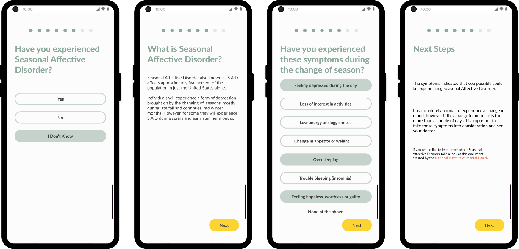
- Lack of connection to nature in the household can lead to the development of Seasonal Affective Disorder (SAD) . This mood disorder affects overall well‑being as it causes depression.
- Location and space restrictions may not allow an opportunity to interact with the outdoors when desired or maintain a garden space.
Primary Research
These assumptions helped us narrow our stakeholders down to adults who remotely work/study full‑time, work long hours (not remotely), or experience Seasonal Affective Disorder (SAD). Our team remotely conducted three contextual inquiries and semi‑structured interviews to gain a deeper understanding of the lives of our stakeholders. The focus of these interviews was to understand our audiences' current connection to nature and if they faced any challenges within their households.
Contextual Inquiries

Primary Research Quotes
I am going to be more stressed. Having as many plants as I
do right now is a pretty significant commitment.
— T
My lights are timed to come on every day at 7:00 am to
replicate natural light from where I would usually see the
sun — D
Primary Reseach Insights:
- Having too many plants can potentially increase stress levels by adding responsibility. There is a desire for a passive routine.
- The presence or lack of nature can have a significant impact on an individual’s well‑being.
- Setting distinct and physical boundaries between different spaces in the household is healthy for one's well‑being.
Ideation
Our research solidified our problem statement. How might we help individuals connect with nature and improve their well‑being by cultivating healthy habits in their household through interactive experiences that take them out of their current space?
Design Principles
Using the insights from our research, we developed four design principles to help address the needs of our stakeholders.

Personalization + Engagement.
Personalization will create an immersive experience, allowing the individual to interact and engage with the product on a level of their choice.

Comfort + Reduce Mental Load.
A solution will alleviate stress for the individual through experiences that do not create added responsibilities and amplify a positive outlook.

Form a Healthy Connection.
A solution will aim to create interaction and connection with the user’s environment, contributing to overall well‑being.

Set Healthy Boundaries.
A solution will aim to create healthy boundaries mentally or physically, which will reduce stress and mental clutter.
Brainstorming Concepts
To help visualize potential solutions for connecting people to nature within their households, our team ideated, sketched, and generated 90 potential products. Because our team was so in sync some of our ideas were similar.

Click image to englarge.
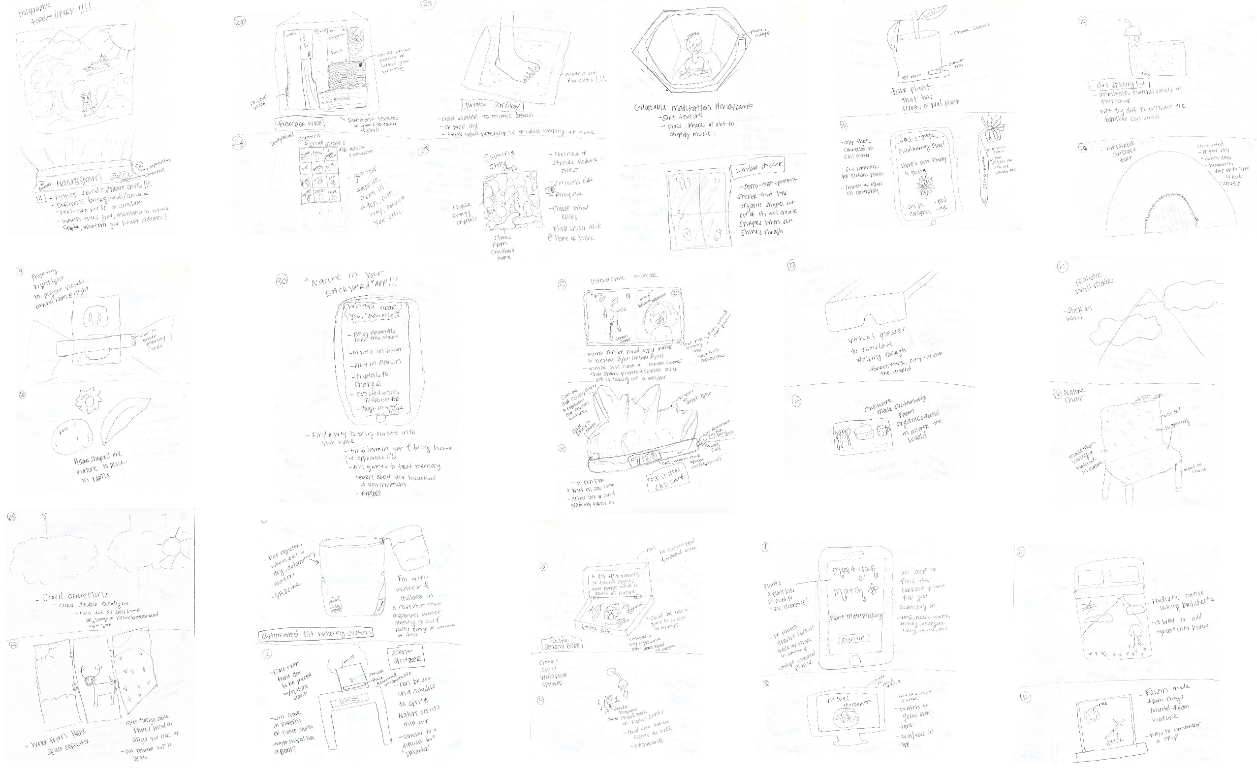
click to enlarge.
Down Selection
For the first round of down selection, we dot voted on the 90 products using the criteria of green: yes , red: no , and blue: partial .
We affinitized the remaining items in the second round of down selection based on if the product was digital, interactive, passive, and physical.
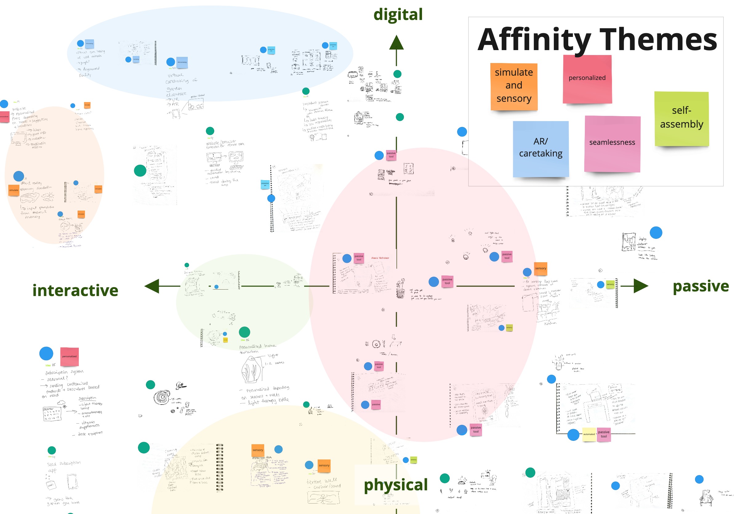
We used our design principles to further narrow our concepts down to 17 that kept our audience's needs at the forefront. Our team continued downselecting until we found three potential solutions. These concepts addressed our concerns of bringing nature into the household without adding pressure to a person's well‑being.


Pivoting
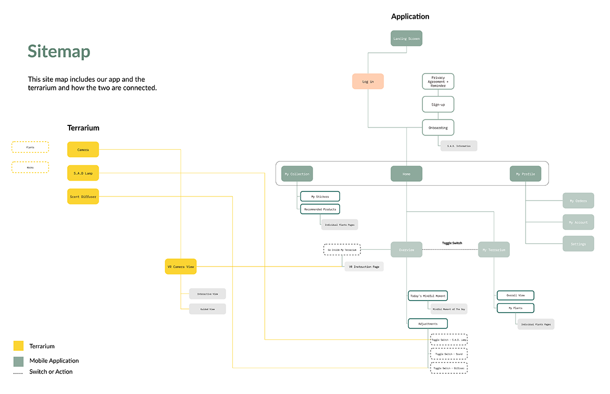
After feedback and re‑evaluating our choices, we virtually walked back to our drawing boards to ideated once more until we found a solution that complemented our problem space. The new concept combined the nature subscription box, a smart terrarium, and a plant sticker collection booklet.
We would create O 2 , a smart terrarium personalized with a SAD lamp, an aromatherapy diffuser, and filled with various handpicked succulents delivered in a subscription‑type manner. The user could then collect stickers in a booklet based on the plants they receive.
This pivot was an obstacle but a vital move to keep our solution focused on our potential users.

Lo‑Fi Prototyping + User Testing
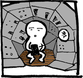
To see if our solution answered our design challenge, we decided lo‑fi prototyping was the best option to test O 2 with our stakeholders. We created a paper prototype for the mobile app, a lo‑fi version of the terrarium and SAD lamp, and the sticker collection booklet.

I designed the prototype for the terrarium aspect of O 2 . Funny enough, I recycled cardboard so much that I had no extra cardboard laying around the house. So instead, I made a scrappy prototype with a large glass bowl, taped a small flashlight to the lid of Tupperware to represent the SAD lamp.
User Testing
Our user testing helped us gather initial thoughts on what role our product would play in their lives and the look and feel of O 2 . I user tested the terrarium and told my participants to imagine a stationary 360 o camera and scent diffuser.

User Testing Insights
- Step away from the “freemium” idea by avoiding prompting users to buy/add newer items without concrete reasoning.
- Scents, lights, and visuals in the terrarium prototype would create an ambiance of nature within your household.
- General background information on Seasonal Affective Disorder should be available.
- Building a sticker collection motivates participants to construct their terrarium + gives them a sense of accomplishment.
- And the built‑in terrarium camera might cause privacy issues.
User Testing Quotes
I do feel like there’s a
disconnection
between the product and the booklet, only because I feel like
you can do also add the
booklet information on the app.
Every time that I water it [plants inside terrarium], I feel
like I get closer to it. It's like you might forget about it,
but every time you have to water it. It’s not really a job, it's
more like,
‘hey I have a thing here that’s living’, and it sort of brings
me peace and all these things. Your focus goes like, ‘yeah I’m
glad it's here.’
I feel as if it is like a
freemium game
in some ways. Once you have made the initial purchase, the
product will continue to try to sell you more add‑ons. I
would say once again,
inform the user on why you are prompting these customized
suggestions.
Pivoting ... Again
The insights directly influenced the finalized version of our solution: O 2 . We nixed the physical sticker book and implemented it within our app. To up the immersive aspect of our design, we upgraded to a movable 360 o camera inside the terrarium to allow for virtual reality capabilities from the accompanying app.
Since our prototypes were scrappy, we easily moved on after pivoting once more after user testing.
Iterations & final designs
SAD Onboarding Design
I soley designed the finalized Seasonal Affective Disorder section. I changed the overall look of this section to keep up with our minimalist theme and make sure there was room to include information on Seasonal Affective Disorder. There is a link to a PDF from the National Institute for Mental Health so our users can educate themselves on this disorder.